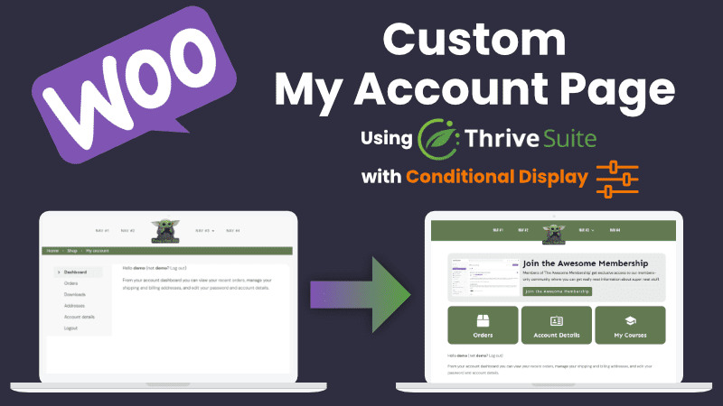
Using WooCommerce with Thrive Suite has many advantages, including using it to sell products (courses and memberships) through Thrive Apprentice or running a full ecommerce suite and simply love the customization that Thrive Theme Builder affords you.
A built-in benefit of WooCommerce is the way they handle user accounts and provide you with a streamlined dashboard. The downside of this dashboard is that it looks practically the same on everyone’s WooCommerce site unless you have a theme that radically changes it for you by default.
Thankfully, we have Thrive Theme Builder to create almost anything we can imagine for the look, and a little CSS magic to make the parts we don’t want disappear.
Below is my complete video tutorial on how to customize your account page template.
Editing Your WooCommerce My Account Template in Theme Builder
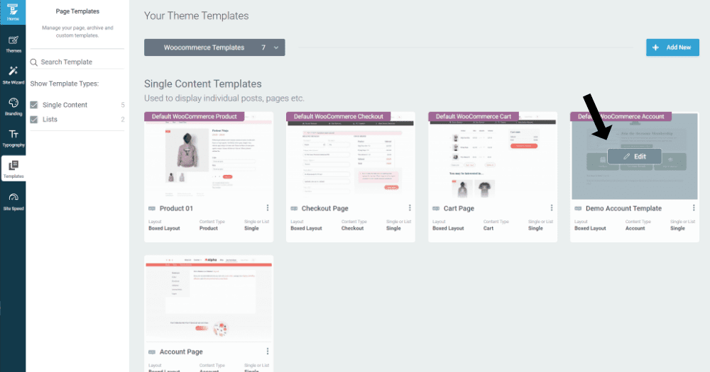
This is important. We want to edit the My Account template in Theme Builder. To find that, go to Theme Builder and templates, then under Core templates swap over to your WooCommerce templates.

You can edit your My Account template live, or you can duplicate it and then make your edits. To preview them properly, though, and have others see them too you’ll need to make this template your default.
Customize Your My Account Dashboard
Now it’s time to use your imagine and your Thrive Architect skills. Completely new to Thrive Architect and Theme Builder? I got you covered. Check out my Thrive Architect Ultimate Essentials course and my Thrive Theme Builder Essentials course.
I recommend a basic ’tile’ type layout, but you’re free to make anything you want.
If you have a complete ecommerce website with lots of SKUs and you’re using WooCommerce to manage your shop, you’ll probably want a section for orders. If you have digital / virtual goods, the downloads section is important too.
If you’re using WooCommerce to facilitate the sale of Thrive Apprentice products, you can link to your courses or products from this page as well.
Use Conditional Display to Customize and Personalize your New My Account Experience
Thrive’s big update in January 2022 introduced a featured called Conditional Display that lets you customize what people see on your website based on many different factors. One of those is whether or not they’ve purchase a product.
One simple use of Conditional Display is to show a promotional block section to those who haven’t purchased your course or membership, but show something completely different to those who have already joined.
To do this, add your conditional content inside of a content box or background section. Navigate in the left menu to the Conditional Display section. You can add however many versions you wish by adding a display, then click the little slider rule looking icon to set your conditions.
Here you can choose to Hide or Show based on the condition, and then proceed with settings rules. In our tutorial here, we used Show -> When User -> Has Access to a Thrive Apprentice Product.
A quick tip for you if you’re using similar content for each condition, just duplicate your Default Display and make tweaks.
Link Your Custom Built Sections to the WooCommerce My Account Areas
The default links for these common areas are as follows:
- Orders: /my-account/orders/
- Downloads: /my-account/downloads/
- Account Details: /my-account/edit-account/
You can find all of these links by hovering over the My Account navigation links. In Chrome, for example, the links are in the bottom left of the browser window.
Custom CSS to Remove WooCommerce Account Page Navigation
You can add this CSS to the WP Customizer or really anywhere you want as long as it applies to the account page.
.woocommerce-MyAccount-navigation {display:none;}.woocommerce-account .woocommerce-MyAccount-content {width: 100%;}.tve-theme-2456 .content-section .account-template-wrapper {padding: 20px; }
This CSS takes away the navigation and expands the content areas of each section to full width. It also adjusts some of the padding that I find is on the Theme Builder templates. You can check out the video in this post for a complete walkthrough of how easy it is to add the CSS.
How to Hide the WooCommerce My Account Dashboard Welcome Message
Here’s a really neat additional CSS trick. You can hide the specific welcome message as well. Here’s the message I’m talking about:
Hello NAME (not NAME? Log out)From your account dashboard you can view your recent orders, manage your shipping and billing addresses, and edit your password and account details.
Add the following CSS to the CSS above and this message will be gone:
div.woocommerce-MyAccount-content > p:nth-child(2) {display:none;}div.woocommerce-MyAccount-content > p:nth-child(3) {display:none;}
When creating your member account page, you’re really only limited by your own ability as a designer. Thrive Suite gives you all the tools you need to build it.
If you run into any questions while building your dashboard, feel free to comment or reach out.

