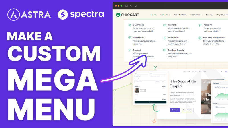
Okay, I have kind of a cool tutorial for you today. I’ve been tinkering a lot with Astra and Spectra, which is a kind of like a block builder enhancement for Gutenberg Block Editor. And inside of Astra, I’ve been wanting to build a completely custom mega menu.
Understanding the Challenge
In fact, let me just go ahead and show you what I’m talking about here on SureCart. They have this really nice mega menu, something that expands out pretty much full width, and it has multiple columns with icons and labels with a description. And I was trying to think this through on how to do it, and I realized that it’s actually pretty difficult, or at least not necessarily intuitive on how to achieve this exact result.
So let me walk you through how I figured it out and some of the cool little tricks that I picked up as I was tinkering with it. And that way you can tinker with it yourself and see if you can build a mega menu like this for your site.
Getting Started with Astra’s Header Builder
Traditional Menu Setup
Now, there are a couple of ways you can do headers in Astra, particularly with the new site builder, that we’re going to use in a big way as part of this tutorial here. But the general way of applying a menu in Astra works, you go into the customizer, you go to the header builder, and you add your primary menu or whatever menu that you want to add somewhere inside of your header. And that’s really all there is to the traditional way of adding your menu.
Creating a New Menu
Now that we have our features heading in place, we need to add the content or what falls underneath in this mega menu. And the word content is important in this context because that’s something that gets used in the mega menu itself.
Building the Mega Menu Structure
Utilizing the Site Builder
This is where the magic happens for the rest of this tutorial. We are going to go into, if we hover over Astra here on the left in the WordPress menu, and we go to site builder and open that in a new tab. This opens up the new site builder tool that Astra released, which is kind of like a theme builder.
Configuring Layout and Elements
We’ll call this our features, make a menu. And I always like to click that eyeball. I don’t know why, but then here now we’re just going to build our menu and we’re going to use the block builder with Spectra, which is made by the same people that make Astra.
Customizing Menu Content
Designing Menu Items
We can come back to this tab and I can just duplicate it three or four times. I think we were going for four of them, right? So there are the four that we have in a row.
Fine-Tuning Design Elements
We do need to make some changes. So for our, our text is a little bit too big here. So if we go back on the right hand side and we look for our content section, we do see that we have a title and we can decide whether we want it to be an H one, two, three, four, et cetera. We could just make it paragraph if we wanted to. And we can bold that now by default, the content, both the title and the text here are going to inherit your theme font or typography settings.
Adding Functionality and Styling
Implementing Hover Effects
Unfortunately, it’s not built into the block. Let me just go ahead and show you. I go to our info box here and I go to the different sections. There’s nothing here about hovering.
Custom CSS Solution
But like I said, with some very simple CSS, which I will include for you inside of the description of this video, or at least right below it, you’ll be able to copy this, drop it in and follow the instructions that are coming up next.
.mm-section :hover {
background-color: #01824c10 !Important;
border-radius: 8px !Important;
}
Finalizing the Mega Menu
Testing and Adjustments
Test the mega menu functionality and appearance on your website. Make any necessary adjustments to fine-tune the design and functionality.
Conclusion
I’ve been having a lot of fun tinkering with Astra and Spectra and finding out what’s possible. It’s a super lightweight theme and it’s not really a page builder. I think they use the word page builder, not quite. It’s just a kind of like an addition to the Gutenberg blocks. But there’s a lot of things that you can do. And I’ve been rebuilding my main Compology site using it just as a challenge to help me learn how to use more tools. So expect more tutorials like this. And if there are particular tutorials or things that you would like to see, by all means, I always like to hear what you would like to see in a tutorial on my channel. But that wraps up everything here from this tutorial. I’ll see you in the next one.

