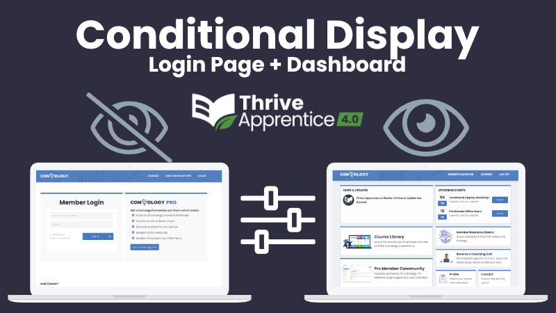
Thrive Suite gives us all of the tools that we need in order to create a custom student or member dashboard that we can seamlessly connect with Thrive Apprentice. We can create beautiful, custom experiences for our users so that they can access their content and be funneled wherever we want them to go.
Now that we have Conditional Display, we can also personalize those dashboards to craft unique experiences for our students as well.
Conditional Display is Personalized Content
Conditional Display is a fancy way of saying the content shown to each user is customized based on a set of rules that we know about them.
- Ownership of a Thrive Apprentice Product
- URL they clicked to get to the page
- Cookie in their browser
- Logged in or out
That’s just a sample of the conditions we can use to determine what content someone sees. When we combine these custom rules with a login page, and with the products and data we have about our customers, we can create something really unique and special.
I have a complete video walkthrough that shows you exactly how to create the perfect login page and dashboard combination that you can watch right below.
Creating the Login/Dashboard Page
Create the Default Display: Login Form
I recommend you start by using a standard page in Theme Builder and edit with Thrive Architect.
Place a Background Section (important) and start by placing your login form inside. Customize the login form so that users can only login, rather than the “Both” option. Set your login form to “Reload” the page.
Add any additional customizations you want to this page. I think it’s a good opportunity to promote your top-tier product!
Enable Conditional Display and Create Your Dashboard
With the background section selected, find “Conditional Display” in the left sidebar (toward the bottom). Click “+ Add Display”. Your existing login form version of the background section will disappear now because you’re editing the second display version of this background section.
Customize the content of this background section and create your dashboard. Need ideas? Check out my latest dashboard below.
Set Your Conditional Display Rules
With the dashboard display version selected (left sidebar area again), hover over it until you see the icon that looks like an abacus or a filter. This brings up the conditional display rules section.
With the dropdown showing “display content”, click the “New Condition Set” button to create a condition that says “When User is Logged In” and save conditions.
Because your dashboard display is above your default display, if the rules/conditions are TRUE, then it will show over the default display.
In other words, if a user is logged out they will see the login form but if they log in the condition we created becomes true and the dashboard display will show.
Benefits of Conditional Display Login Pages
Get Rid of that “You’re already logged in” Message
Unfortunately, a lot of Thrive Apprentice sites simply add a login form to a page and redirect the user somewhere, but that login page is still completely visible and navigable for users.
That means people could actually see the login page, and a message that says “You’re already logged in.” That’s kinda awful.
With Conditional Display on our login form, users will NEVER see the login form or its associated messaging if they are already logged in because it’s hidden behind the display condition rules.
Fewer Pages to Edit
I also really like that all of this is on one page and we don’t have to make multiple pages to edit. We just make the login page, set it in Thrive Apprentice as our login page, and it doubles as our dashboard which is the most-used page on our entire site.
Take Your Dashboard Game to the Next Level
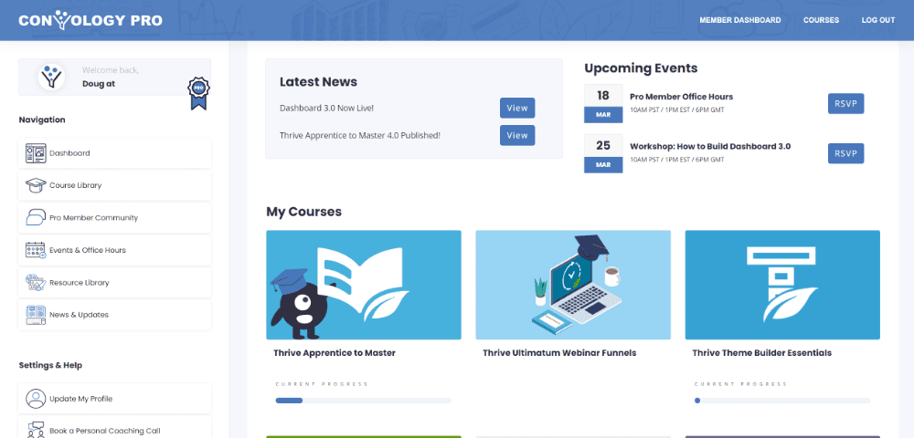
I recently launched version 3.0 of the Convology Dashboard.

This gorgeous full-width dashboard features conditional display throughout.
When users log in the dashboard knows if they are a member of Convology Pro or not. The logo automatically adapts to reflect that status. Pro members also see a custom badge next to their name and a few other member-only enhancements.
This full-width dashboard is the exact same page as the login page, and users are able to navigate back here and always have the dashboard at their fingertips.
Everything you see in Dashboard 3.0 was built using Thrive Suite.
Want a Thrive Apprentice student dashboard like this? I teach a live workshop for members on how to build this exact dashboard. Check out our membership options if you’re interested!

